Pharmacy Labels and Warning Stickers: Interpreting Additional Information
 May, 12 2026
Pharmacy Label Safety Checker
Evaluate your current prescription bottle based on the article's guidelines.
Does this medication contain Opioids/Controlled Substances?
Visual Simulation:
Select options on the left and click "Check Compliance" to see if your label meets the new federal and state standards described in the article.
Have you ever stared at a pill bottle, squinting at tiny text, wondering if you’re supposed to take that medication with food or on an empty stomach? You are not alone. For years, the look of your prescription label depended entirely on which pharmacy printed it, what state you lived in, and even which software system they used. This wild variability has led to confusion, missed doses, and serious mistakes. But things are changing fast. New federal rules and strict state laws are forcing pharmacies to rethink how they label your meds. If you want to stay safe, you need to know what those new stickers and labels actually mean.
The Push for Standardized Pharmacy Labels
For a long time, there was no single rulebook for how a pharmacy label should look. One pharmacy might use bold red fonts for warnings, while another used small blue text. This inconsistency is dangerous. The United States Pharmacopeial Convention (USP) recognized this problem back in 2012 when they released General Chapter <17>. Their goal was simple: create universal standards so every patient gets the same clear information, regardless of where they fill their prescription.
The real game-changer, however, is coming from the Food and Drug Administration (FDA). They have proposed the Patient Medication Information (PMI) rule. Think of this as a major overhaul. Instead of cluttered pages full of legal jargon, the PMI rule aims for a single-page, standardized format. It focuses only on the essential instructions and safety info you actually need. The goal is to cut down on medication errors by making labels easier to read and understand, especially for older adults managing multiple drugs.
Decoding Warning Stickers and Color Codes
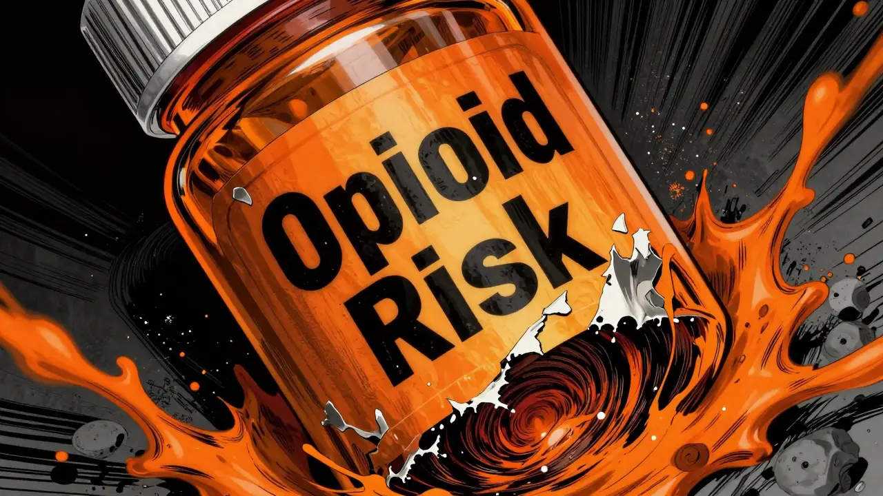
You’ve probably seen bright orange or red stickers slapped onto prescription bottles. These aren’t just decoration. They are critical safety alerts. Different states and pharmacies use specific colors and symbols to warn you about high-risk medications. For example, Connecticut passed a law effective January 1, 2024, requiring all controlled substance and opioid prescriptions to have a fluorescent orange warning label. The sticker must be exactly 1 1/4 inches in diameter. That specific size ensures it catches your eye immediately.
These warning stickers often carry messages like "CAUTION: OPIOID Risk of Overdose and Addiction." Companies like PDC Healthcare produce these specific labels, ensuring they meet strict durability and visibility standards. When you see a red or orange sticker, pause. Read the text carefully. It is telling you that the medication inside carries a higher risk of misuse or severe side effects. Ignoring these visual cues can lead to dangerous outcomes.
| Label Type | Color Requirement | Typical Size | Purpose |
|---|---|---|---|
| Opioid Warning | Fluorescent Orange | 1 1/4 inch diameter | Alert to addiction risk |
| General Caution | Red with White Text | Varies (e.g., 1-9/16" x 3/8") | Highlight specific risks |
| Allergy Alert | Bright Yellow or Red | Standard rectangular | Prevent allergic reactions |
Typography, Contrast, and Readability Standards
If you struggle to read small print, you will be glad to hear that regulations are getting stricter about font sizes. Under new guidelines, key information on your label must use sans-serif typefaces. Why? Because fonts like Arial or Helvetica are easier to read than fancy scripts. The minimum font size for essential info is now 6-point. For warning text, it must be 8-point or larger.
Contrast matters just as much as size. Black text on a white background is standard, but some pharmacies were using gray text on light gray paper. That is a recipe for disaster, especially for patients with visual impairments. The new rules enforce specific contrast ratios to ensure the text pops off the page. This helps older adults, who make up a large portion of prescription users, to safely manage their health without needing a magnifying glass.
The Role of Barcodes and Digital Verification
Look closely at your next prescription label. You will likely see a square barcode. This is usually a GS1 DataMatrix or Code 128 barcode. It’s not just for inventory. It encodes critical data like the National Drug Code (NDC), lot number, and expiration date. When the pharmacist scans this code, it verifies that the medication matches the doctor’s order exactly.
This technology is part of a broader shift toward automated verification. Systems like Barcode Medication Administration (BCMA) scan the label before it reaches you. They check the barcode, the text layout, and even the warning stickers. If anything doesn’t match, the system flags it. This double-check process significantly reduces the chance of human error. As we move toward 2025 and beyond, expect more digital integration, including QR codes that link to video instructions or multilingual guides.

State Variations and Compliance Challenges
While the FDA pushes for national standards, individual states still have their own rules. This creates a patchwork landscape. For instance, California requires multilingual labels for many prescriptions because nearly half of Limited English Proficiency (LEP) patients reported difficulty understanding standard instructions. On the other hand, Connecticut focuses heavily on physical warning stickers for opioids. The National Association of Boards of Pharmacy (NABP) has noted this wide variability for years and supports standardization, but enforcement remains a state-by-state decision.
This complexity hits independent pharmacies hard. Upgrading systems to meet 2025 compliance can cost between $5,000 and $15,000 for small shops. They need new label printers, software updates, and staff training. Despite these costs, the industry is moving forward because the alternative-medication errors-is far more expensive in terms of health and safety.
Practical Tips for Patients
So, what should you do as a patient? First, always check the label when you pick up your meds. Does the name match what the doctor prescribed? Is the dosage clear? Second, pay attention to those warning stickers. If you see a bright orange or red label, ask your pharmacist to explain the specific risks. Don’t assume you know what it means based on past experience. Third, if the font is too small or the contrast is poor, speak up. Ask them to reprint it with larger text. Many pharmacies can adjust their settings for accessibility.
Finally, keep your medications organized. Use a pill organizer if you take multiple drugs. This reduces the temptation to guess which bottle contains which med. Clear labels help, but good habits save lives. As regulations tighten and labels become more standardized, your job is to stay engaged and ask questions whenever something looks unclear.
Why are pharmacy labels changing?
Pharmacy labels are changing to reduce medication errors and improve patient safety. Past inconsistencies in design, font size, and warning placement led to confusion. New standards like the FDA's Patient Medication Information (PMI) rule aim to create a uniform, easy-to-read format that clearly communicates dosage and safety info.
What does the orange warning sticker mean?
An orange warning sticker typically indicates a controlled substance or opioid. In states like Connecticut, this fluorescent orange label is mandatory for such prescriptions to alert patients to the risk of overdose and addiction. Always read the text on the sticker for specific details.
When will the new FDA labeling rules take effect?
The FDA's proposed Patient Medication Information (PMI) rule is expected to be finalized in late 2024, with implementation required by January 1, 2025. This timeline allows pharmacies time to upgrade their technology and train staff.
How can I tell if my label meets new standards?
Look for sans-serif fonts, minimum 6-point text for essential info, and 8-point text for warnings. High contrast between text and background is also key. If the label is cluttered or uses small, hard-to-read script, it may not yet meet the latest best practices.
Do all states follow the same labeling rules?
No, there is currently significant variability across states. While the USP provides voluntary guidelines, enforcement depends on state boards of pharmacy. Some states, like California and Connecticut, have implemented stricter requirements regarding multilingual support and warning stickers.